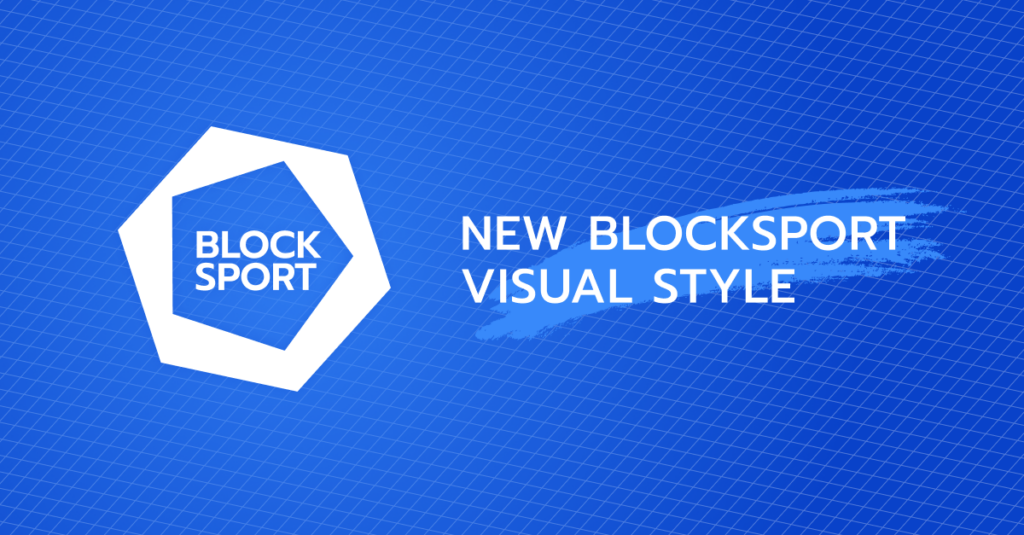
Today we are pleased to announce our new visual style, as a modern and developing company we want to show that our visual assets follow the vision and key messages of Blocksport.
In general, our new branding became more falt and simplified to present how simple and clear can be digitalization and tokenization for every sport and esport club and organization, as digital and blockchain are new to most of the fans and sports executives we want to show that it can be simple to understand for everyone and enjoy the new possibilities.
We decided to keep up with the blue color for our branding as the main color that symbolizes the modern blue ocean strategy of business which is all about partnership and collaboration and that’s what Blocksport strategy is all about.
Our new logo and branding identify the key aspects of Blocksport – a symbol of a block that presents blockchain the system which is a basis for all our products and services, tokenization, and digitalization of sports and esports. The second symbol which is inserted into a block is a ball – which is a part of most sports both team and individual, you can see it in football, basketball, volleyball, golf you can see it as a puck in hockey and in many different other sports.
That’s why our new visual style simply implies what Blocksport is – ‘block’ and ‘sport’ and their combination to open the world of tokenization and digitalization for all sports organizations and their fans and to show the transparent way of using those technologies to build new relationships between organizations and fans.